Choosing the Best Fonts for a Resume
Are you in the middle of creating your resume but are stumped by which fonts to use? Of course, there are hundreds of fonts out there from which to choose, but not all are appropriate for use in a resume. Let’s take a look at the ones that are considered to be the best—and which ones are good to avoid.
Serif and Sans Serif Fonts Are Most Recommended
There are two font families that recruiters and HR managers seem to like the most: Serif and Sans Serif. The Serif font family means that the fonts have tails; and Sans Serif means they are missing the tails on the ends of letters.
Popular font types in the Serif family include Georgia and Times New Roman—while popular Sans Serif fonts include Verdana and Arial. It’s a good idea to note, however, that some managers have disdain for Times New Roman and Arial because they tend to be used so often.
Find Fonts That Work on All Types of Computers
There are some cool fonts out there that you may be tempted to use because they look both professional and appealing. But if you want to ensure that your resume translates well on PCs (Windows) and Macs, it’s better to pick fonts that are available on both.
For instance, you may love Palatino Linotype as a Serif font on your PC. But since it doesn’t have an immediate translation on a Mac, aside from the similar Palatino, it could look different from your original copy when pulled up on anything other than a PC. It’s good to keep this in mind as you choose your fonts.
Sidestep “Fun” Fonts
Also, when choosing fonts, it’s a good idea to sidestep cursive fonts like Comic Sans or other fun fonts that you might enjoy but lack professionalism. The only exception to the “fun” font might be if you’re submitting your resume for a unique job—such as one in the entertainment industry. But even then, it’s good to know for sure that the employer will be agreeable to this before creating your resume.
While you’re thinking about font types, it’s also wise to remember that the average font size for a resume is 10 to 14 points (10-12 for regular text and 12-14 for subheadings). By thinking as much about your fonts as the content in your resume, you’re sure to create a document that a hiring manager is eager to read.
Global resume authority Jessica Hernandez of http://www.greatresumesfast.com is a former HR Manager who partners with professional- and executive-level candidates to create authentic, branded resumes and cover letters. An international resume columnist and resume expert for JobTalkAmerica radio, her work opens doors to lucrative positions at Fortune 500 companies.
Share this post:

About the author
Jessica Hernandez, President, CEO & Founder of Great Resumes Fast
Hi, I’m Jessica. I started this company back in 2008 after more than a decade directing hiring practices at Fortune 500 companies.
What started as a side hustle (before that was even a word!) helping friends of friends with their resumes has now grown into a company that serves hundreds of happy clients a year. But the personal touch? I’ve kept that.
You might have seen me featured as a resume expert in publications like Forbes, Fast Company, and Fortune. And in 2020, I was honored to be named as a LinkedIn Top Voice of the year!
I’m so glad you’re here, and I can’t wait to help you find your next perfect-fit position!
2 Comments
Leave a Comment
Improve Your Resume: Download Your Free Executive Resume Template Today
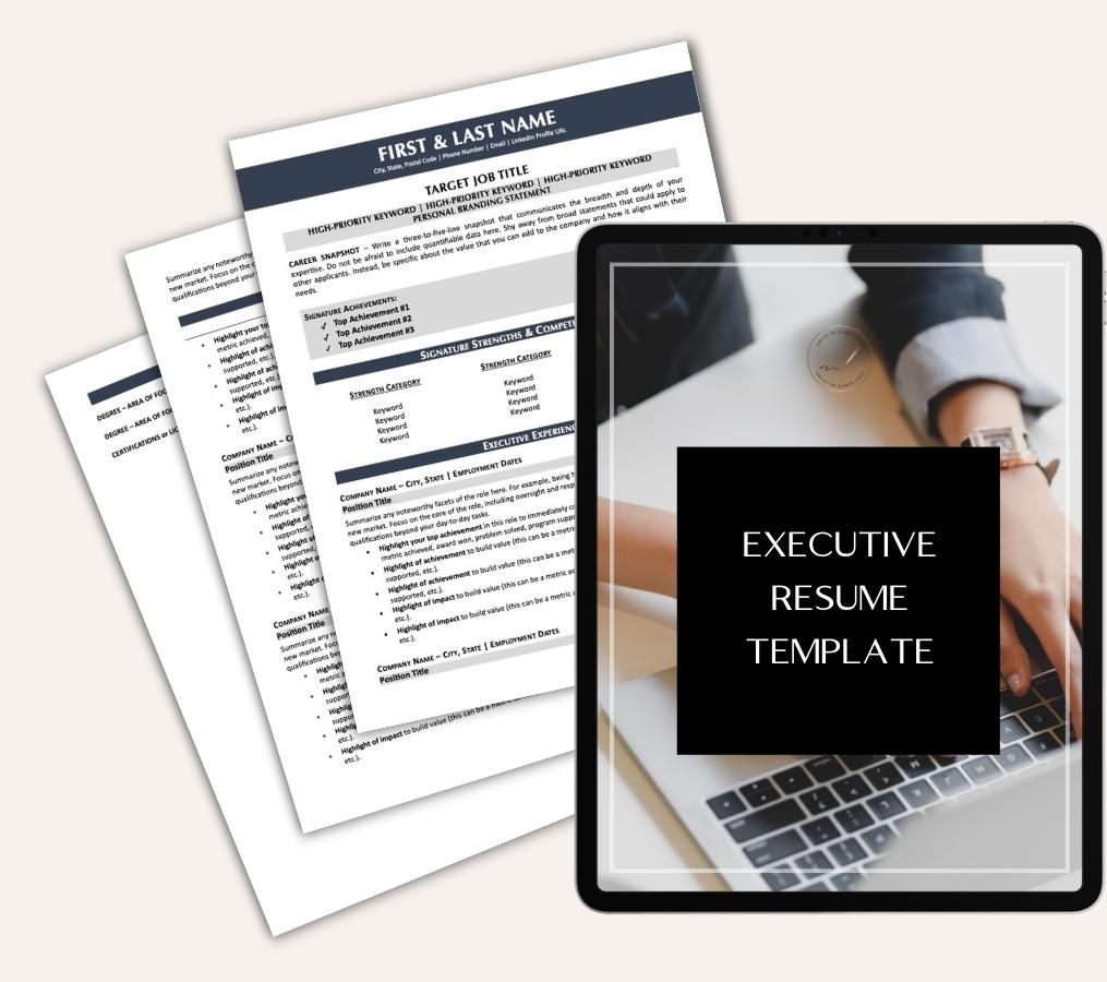
Are you struggling to create an executive resume that will impress employers? Download this free executive resume template and receive a series of 10 emails with expert guidance on how to write resume content that resonates with employers so you get more interviews.
It's everything you need to stand out, make an impression, and accelerate your job search.


Are there other fonts besides serif and sans-serif?
[…] for a professional format, be aware of the font size and font style you are using. In some industries, you may have more liberty to be creative, perhaps even submit an […]